Grasshopper Objects Explained
Grasshopper Definition Objects
A Grasshopper Definition can consist of many different kinds of objects, but in order to get started you only need to familiarize yourself with two of them:
- Parameters
- Components
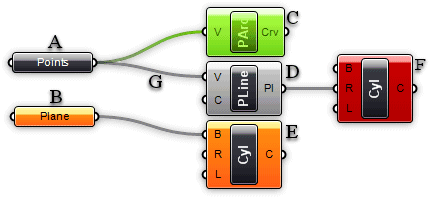
Parameters contain data, meaning that they store stuff. Components contain actions, meaning that they do stuff. The following image shows some of the possible objects you are likely to encounter in a History Definition:
A) A parameter which contains data. Since there is no wire coming out the left side of the object, it does not inherit its data from elsewhere. Parameters which do not contain errors or warnings are thin, black blocks with horizontal text.
B) A parameter which contains no data. Any object which fails to collect data is considered suspect in an Explicit History Definition since it appears to be wasting everyones time and money. Therefore, all parameters (when freshly added) are orange, to indicate they do not contain any data and have thus no functional effect on the outcome of the History Solution. Once a parameter inherits or defines data, it will become black.
C) A selected component. All selected objects have a green sheen to them.
D) A regular component.
E) A component containing warnings. Since a component is likely to contain a number of input and output parameters, it is never clear which particular object generated the warning by just looking at the component. There may even be multiple sources of warnings. You'll have to use the context menu (see below) in order to track down the problems. Note that warnings do not necessarily have to be fixed. They may be completely legit.
F) A component containing errors. Similar to warnings, it is not possible to see where the error was generated in a component. You'll need to use the context menu (see below). Note that a component which contains both warnings and errors will appear red, the error colour takes precedence over the warning colour.
G) A connection. Connections always appear between an output and an input parameter. There is no limit to how many connections any particular parameter may contain, but it is not allowed to create a setup with cyclical/recursive connections. Such a recursion is detected and the entire Solution is short-circuited when it occurs, resulting in an error message in the first component or parameter that was detected to be recursive. See Volatile Data Inheritance for further info on connection wires.
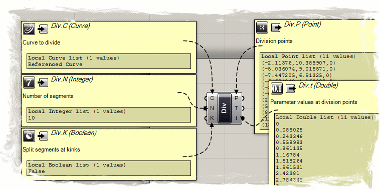
A component usually requires data in order to perform its actions, and it usually comes up with a result. That is why most components have a set of nested parameters, referred to as Input and Output parameters respectively. Input parameters are positioned along the left side, output parameters along the right side:
A) The three input parameters of the Division component. By default, parameter names are always extremely short. You can rename each parameter as you please.
B) The Division component area
C) The three output parameters of the Division component.
When you hover your mouse over the individual parts of a Component object, you'll see different tooltips that indicate the particular type of the (sub)object currently under the mouse. Tooltips are quite informative since they tell you both the type and the data of individual parameters:
Using Context Popup Menus
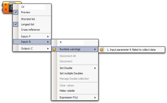
All objects on the Canvas have their own context menus that expose most of the features for that particular component. Components are a bit trickier, since they also expose (in a cascading style) all the menus of the subobjects they contain. For example, if a component turns orange it means that it, or some parameter affiliated with the component, generated a warning. If you want to find out what went wrong, you need to use the component context menu:
Here you see the main component menu, with the cascading menu for the “R” input parameter. The menu usually starts with an editable textfield that lists the name of the object in question. You can change the name to something more descriptive, but by default all names are extremely short to minimize screen-real-estate usage. The second item in the menu (Preview flag) indicates whether or not the geometry produced/defined by this object will be visible in the Rhino viewports. Switching off preview for components that do not contain vital information will speed up both the Rhino viewport framerate and the time taken for a History Solution (in case meshing is involved). If the preview for a parameter or a component is disabled, it will be drawn with a faint white hatch. Not all parameters/components can be drawn in viewports (numbers for example) and in these cases the Preview item is usually missing.
The context menu for the “R” input parameter contains the orange warning icon, which in turn contains a list (just 1 warning in this case) of all the warnings that were generated by this parameter.


