Sidebar
Documentation about the new Rhino4 toolbar images.
Rhinoceros 4.0 icons
Contents
Introduction
The toolbars in Rhino underwent a rigorous rewrite between versions 3 and 4. Among other new features, Rhino4 toolbar buttons now support images with alpha-channels as opposed to earlier versions of Rhino which only contained a one-bit transparancy mask (yes-or-no, transparant-or-opaque). Alpha-channel blending allows for a better integration of icons into the workspace. This WIKI page provides information about how alpha-channeled icons work, how you can change existing icons and how to make new icons that look like the default set.
Channels
All pixel images are stored in (usually a combination of) channels. The most famous combination is the RGB (Red-Green-Blue) mix. An RGB image contains three channels, each of which controls a specific property of every pixel; namely the amount of red, green and blue that goes into making the final colour. Greyscale images contain only one channel which controls the amount of white for every pixel. In an RGBA (Red-Green-Blue-Alpha) image, there are four channels. The alpha channel controls the level of transparancy per pixel. Since this level can have 256 different values (0 equals completely transparant, 255 equals completely opaque and values in between indicate a partial transparancy), we can now use varying levels of transparancy per pixel in toolbar icons:
| |
 |
| Here you see an image with a binary alpha channel. Pixels are either completely opaque or completely transparant. No middle ground. Binary alpha channels do not mix well into variable backgrounds. This is why anti-aliasing is impossible with 1-bit alpha channels. |
| |
 |
| And the same icon with a smooth alpha channel (256 different levels of transparancy). Note that these partially transparant pixels typically only occur along the edges of the image. This is called anti-aliasing. 8-bit alpha channels provide sufficient blending range to make icons that work well on any background. |
Note that properly aligned vertical and horizontal lines look exactly the same whether that have anti-aliasing or not. Alpha-channels are an additional feature to be used when applicable, they do not replace existent functionality. In other words, images with alpha-channels can behave exactly the same as images without, but not the other way around.
Pixels
The above-mentioned anti-aliasing constitutes more than just a few semi-transparant pixels near shape edges. Since there is plenty of reading material available on this topic on the web, I shall only briefly dive into it.
Anti-aliasing is an intelligent way of adding sub-pixel detail to images. Instead of finding the object in the drawing which is the dominant one for any given pixel, all objects are sampled and combined based on their relative dominance. For every pixel in the image, the amount of overlap with every object is measured and the resulting colour of that pixel becomes the weighted average of the colours of all overlapping objects^1^ . I'd love to type a thousands words on the subject right now, but I think I'll get out cheap by using an example:
| {http://en.wiki.mcneel.com/content/upload/images/ProperPixelAlignment_Vector.png}} |
| Here you see two images, representing two manifestations of the same drawing. The image on the left is a screenshot of the program that was used to draw the image and it shows the on-screen rendering of vector objects. All the shapes are defined by line and bezier segments in a continuous space (i.e. not gridded such as pixel-images). The image on the right shows the anti-aliased pixel bitmap that was extracted from the vector-drawing. Both images have been blended with a pink background. |
The size of the extracted image is 24×24 pixels and since this information was available when the vector drawing was made, the vector shapes have been neatly aligned to a 24×24 grid. Let's take a closer look at column #4, shall we?
The only object which overlaps with this column is the black outline of the box. 11 pixels in column #4 are not overlapped by any object and are thus left completely transparant. 9 pixels are completely overlapped by the outline and thus inherit the colour of the outline without modification. None of these pixels contain any anti-aliasing. It is the 4 pixels at the top and bottom of the outline shape which are interesting right now. They are only partly obscured by the outline shape and as a result, the colour of these pixels is not 100% black as you can see in the right image. The amount of transparancy in these pixels is directly linked to the amount of overlap they experience. Actually, only the topmost pixel (column:4 row:8) has a notable blending. The overlap in the other three pixels is so nearly 'all-or-nothing' that the blending is hardly visible. This is not an accident. Anti-aliasing is all fine and dandy, but it works by averaging pixels, which means that an anti-aliased line is always more fuzzy than an aliased (or 'pixelated') line. Anti-aliasing is a bit like a jack-hammer in this respect; it's a very useful tool but you don't necessarily want to use it to change a light bulb. If you do, you'll end up with the following:
| {http://en.wiki.mcneel.com/content/upload/images/FaultyPixelAlignment_Vector.png}} |
| Here, the vector objects have been moved half a pixel left and upwards. You can see that there are many more pixels partly obscured by the black outline and no pixels at all which are completely obscured. The resulting 24×24 icon (on the right) lacks all the crisp features of its aligned brother. |
The lesson so far: Do not use anti-aliasing if you can get away without it. (Near) vertical and horizontal lines should always be drawn without anti-aliasing, but tilted and curved lines do not rely on accurate alignment and thus they can be drawn with anti-aliasing. If you use anti-aliasing, try to optimally align the shapes to the pixel-grid.
| Tilting angles | |||||||||
| 0 | 5 | 10 | 15 | 20 | 25 | 30 | 35 | 40 | 45 |
| Anti-aliased | |||||||||
 |  |  |  |  |  |  |  |  |  |
| Pixelated | |||||||||
 |  |  |  |  |  |  |  |  |  |
The above table shows the difference between anti-aliased and pixelated lines at different tilting angles. It becomes clear that low angles (near 0° or 90°) result in extreme fuzzyness of anti-aliased lines.
Creating your own icons
If you want to change an existing icon into something slightly different (if you've written a script for which you would like to add to a button for example), there's three things you can do:
- Change pixels in the icon image (for adding pixelated image elements)
- Change pixels in the base image (for adding anti-aliased image elements)
- Change vectors in the original drawing (for making wholesale revisions)
| Example: |  |
And never forget to adhere to these rules:
Changing the icon image
This is the simplest method of changing icons. You do not need any software besides Rhino^2^ . It is ideal for adding pixelated geometry such as texts, arrows or simple lines (0°, 45° or 90°).
First, copy the button you want to change to a new location and then open the button editor using Shift+RMB. Let's assume for the time being, that we've written a new command alias to create a box by picking a base edge and a point on the opposite edge. In order to create a new button for this, we need to copy the regular box button and change the way it works. Open the button editor by Shift+RMB and you'll see the following dialog:
 |
I've already updated the text fields in the button editor to cater for our new tool, but the icon is still unchanged. We have to open the Rhino Bitmap Editor if we want to fiddle with the pixels:
 |
Now we can change pixels in the image. We need to highlight one edge (i.e. make it 2 pixels wide and white), mark it off by point objects (4×4 pixel blocks with a black outline and creamy white center) and add a point object on the opposite edge. Like so:
 |
Other examples of pixelated geometry are arrows and texts. You can add these to existing buttons very easily. Use the following table of pixel-rules to make your icons compliant with the default ones:
| |
| Every red square is synonymous with a single pixel |
Changing the base image
In order to facilitate the creation of anti-aliased icons, all images have been rendered to large bitmaps as well. All the icon images are available as full-colour, full-alpha png images. These 'base images' can be used to add anti-aliased geometry to icons. Since base images are much larger than actual icons, anything that is drawn into the base image is downsampled a number of times and thus automatically anti-aliased. You'll need a separate pixel-editor for this job such as PhotoShop, PaintShop, CorelPaint or anything else which exceeds Microsoft Paint. In this case JASC Paint Shop Pro has been used, but the methodology is fairly general.
First, you need to load the base image into the editor and apply the alpha channel (some editors will load the alpha automatically), you will see something like this:
 |
| Note that the image displayed here is only 384×384 pixels large, the original base images are twice this size. I.e. base images are 32 times larger than the icons. I have also enabled the display of the pixel-grid (the dotted black lines). If you look closely at the image you'll notice that it is pixelated. This makes it easier to post-process the image. |
Now imagine we have a command (or a macro or alias or whatever) which applies a green glass material to an object and we use this command more than 261 times a day. It would be nice to have a button that runs the command for us, and it would be even nicer to have a neat icon that accompanies it. Obviously this icon needs to be a green, transparant something. Since we've used the box icon before, we'll use it again here.
In order to make the box icon transparant and green, we cannot use the simple method of changing individual pixels. First off, the transitions between the sides of the box are anti-aliased, so we would manually have to invent all those new blending colours. This is not impossible to do, it's just boring. After we've changed the hue of the image, we also need to make it transparant. A good illusion of transparancy is to highlight some occluded faces and to darken others. This would also be very tedious to do on a per-pixel basis. If you have a good pixel-editor, these adjustments are peanuts:
 |
| I have applied new colours to the faces using the paintbucket tool, then I've copied the two vertical faces of the box onto the opposite sides using the magicwand selection tool, changed their colours (to white and black respectively) and made them very translucent. These faces should be behind the box, but we can draw them on top of the box using such trickery. You can see that the image conveys a strong sense of transparancy. |
My edited image has collected a few extra layers on the way and before I can put the image into Rhino, I need to combine all superimposed layers and turn it into a small icon (say, 24×24 pixels). If you need to merge (combine) layers, make sure you do not simply flatten the image. Flattening typically destroys any existent alpha-channels. JASC Paint Shop Pro provides several merging modes, Merge Visible is the one we need:
 |
After the image has been merged into a single layer including an alpha-channel^3^ (provided this was necessary), the drawing has to be downsampled to the size of the icon. Be sure to use a good sampling algorithm when resizing the image (bicubic, bilinear or lanzcos for example). If you're using an unsuitable algorithm, your icon will end up looking fuzzy or pixelated:
 |
| JASC Paint Shop Pro comes with a Smart Size algorithm which usually delivers good results. |
Changing the vector drawing
Sometimes, we need to make so many changes to an icon, that adjusting the base or icon image is not an effective approach. In that case (or even if you need to create a new icon from scratch), you're better off using a vector editor to fiddle with the vector objects that make the icon. All Rhino4 icons were drawn in XaraX , but you can also use Illustrator or Freehand or any other illustration package. The source files (each containing many related icons) are available for download from this wiki page.
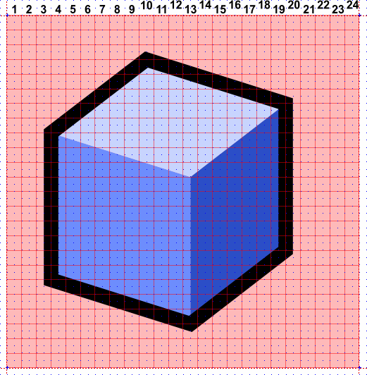
The first order of business when creating new icons, is to find one which reasonably resembles our goal. It is of course possible that no existing icon looks anything like what you're after, but those cases are rare. Let's assume we once more need the Box icon:
 |
The vector source images have been layered to lubricate the alignment and export tasks. In XaraX, layers can reside either in the background or the foreground. Layers in the background (Guides and Background) will not be included when Xara converts the vector drawing to a pixel image. The only object in the Background layer is the green square behind the icon. This square is used to preserve the alignment and positioning of the foreground objects with respect to the pixel-grid. It is of no importance yet.
The Guides layer contains a set of infinite lines that mark the boundaries of all icon areas (the red, dotted lines). It, too, can be ignored at this time.
The Obj_Base layer contains all the objects that make up our icon. The blue faces and the black outline in this particular case.
The Pixelgrid layer contains a red grid which corresponds with the pixels of a 24×24 icon. You can use this grid to align your objects. Additionally, the Xara file has a predefined grid (just like Rhino) which has been preset at half-pixel intervals, this means you can easily snap to pixel-centers and pixel-borders. Using Xara's illustration tools, you can quickly adjust the vector objects to make new icons:
 |
| I dragged a few control points around to new grid locations, made two copies and changed a few colours. Adjusting the icon did not take longer than one minute. |
Once you are happy with the new image, you have to create an icon file that Rhino understands. Depending on which application you are using, you can use one of the following methods:
- Save the icon directly
- Create a base image
Save the icon directly
If your vector illustration program delivers good anti-aliasing on small scales, you can simply save the vector objects directly to a 24×24 *.png file:
 |
| In Xara, this method works very well, especially with properly aligned vectors. Xara's internal renderer automagically snaps certain objects to the pixelgrid, so crispness is easy to attain. The leftmost pane shows the image as it will be saved, the icon itself is only 17 pixels wide and 22 pixels high, but it needs to be positioned in the center of the square icon area, hence the need for a background rectangle. |
Creating a base image
If saving images at small sizes does not give you satisfactory results, you can take the long way round and create a base image. You'll have to downsample it separately in a pixel-editor as discussed in the previous paragraph . This image should be large enough to fit a whole number of times around the icon. I recommend using nice round (from a computers point of view) numbers such as 16, 24 or 32. Starting from an icon size of 24, a few multiplication factors with resultant base dimensions and downsampling factors (the number of base pixels that will go into creating a single icon pixel) are:
| Factor | Dimensions | Downsampling |
| 8× | 192×192 | 64 |
| 16× | 384×384 | 256 |
| 24× | 576×576 | 576 |
| 32× | 768×768 | 1024 |
 |
| Always remember to include the alpha channel in the exported png file. |
I also recommend turning off anti-aliasing when creating base images. It serves no purpose and only gets in the way of post-processing operations.
Geometry rules
When creating your own icons, you should adhere to the Rhino native style. There is no tight set of rules for icons, but a few general pointers do exist:
- All lines in icons should be a whole number of pixels thick (the default set only contains 1 and 2 pixel lines)
- White (or other bright) lines should be at least 2 pixels thick
- Try not to use the pixels along the edges of the icon (this leaves an active icon size of 22×22 pixels)
- Try to use the same view projection as the Box image
- Avoid near-vertical and near-horizontal lines
- Try to avoid using texts in icons (this clashes with localization)
- Use outlines for areas which are adjacent to the transparant background.
- Use the colours in the default palette
Standard palette
| Colour definition (R,G,B) | Usage | |
 | 255,255,255 | Brightest areas of regular objects |
 | 242,242,242 | Normal areas of regular objects |
 | 197,197,197 | Dark areas of regular objects |
 | 83,83,83 | Extra dark areas of regular objects |
 | 200,212,255 | Brightest areas of emphasized objects |
 | 110,142,255 | Normal areas of emphasized objects |
 | 45,80,200 | Dark areas of emphasized objects |
 | 0,32,136 | Extra dark areas of emphasized objects |
 | 255,235,116 | Brightest areas of selected objects |
 | 255,218,0 | Normal areas of selected objects |
 | 175,90,0 | Dark areas of selected objects |
 | 118,60,0 | Extra dark areas of selected objects |
 | 225,0,0 | X-axis |
 | 33,178,0 | Y-axis |
Footnotes
^1^ Applications who render anti-aliased geometry onto the screen use a method similar to this, but downsizing a pixel image (downsampling) has the same effect.
^2^ Note that if you have access to a good pixel-editor you could technically use a whole range of tools and filters (blurring, hue changes, contrast adjustments to name but a few) on the small icon images. You'll have to extract the icon from the button onto the hard-drive and edit it separately though. Rhino only provides the most basic drawing tools.
^3^ Many high-end pixel editors provide more ways than one to deal with transparant pixels. The most common modes are Alpha-channels and Mask-layers. The difference between the two, is that alpha-channels contain the transparancy information in the colour of the pixels itself, while mask layers simply use a separate grey-scale image to control the transparancy. If you're having problems saving *.png files with proper transparancy information, try switching between these modes.
Downloads
| Download all Base images (768×768 pixels) for the 24×24 icons: | NOT YET AVAILABLE (0 kb) |
| Download all Base images (768×768 pixels) for the 32×32 icons: | NOT YET AVAILABLE (0 kb) |
| Download all vector images (*.xar format) for the 24×24 icons: | NOT YET AVAILABLE (0 kb) |
| Download all vector images (*.xar format) for the 32×32 icons: | NOT YET AVAILABLE (0 kb) |
| Download all vector images (*.ai format) for the 24×24 icons: | NOT YET AVAILABLE (0 kb) |
| Download all vector images (*.ai format) for the 32×32 icons: | NOT YET AVAILABLE (0 kb) |
{@


![]()
![]()

![]()
![]()
![]()
![]()
![]()
![]()

}@
]
de/rhino/rhinoicons.txt · Last modified: 2020/08/14 (external edit)