Sidebar
Icone di Rhino 4
Icone Rhinoceros 4.0
Sommario: Documentazione sulle immagini delle nuove Toolbar di Rhino4.
Contenuti
Introduzione
Nel passaggio dalla versione 3 alla 4 di Rhino, le Toolbar sono state riprogettate in modo radicale. Tra le altre nuove caratteristiche, i bottoni delle toolbar di Rhino4 adesso supportano immagini dotate di canali-alpha al contrario delle versioni precedenti di Rhino, che erano dotate di una semplice maschera di trasparenza di un bit di profondità (si-o-no, transparente-o-opaco). La sfumatura Canale alpha consente una integrazione meno intrusiva delle icone nello spazio di lavoro. Questa pagina WIKI fornisce informazioni sul funzionamento delle icone dotate di canali alpha, su come modificarle e crearne di nuove con la stessa qualità di quelle di default.
Canali
Tutte le immagini formate da pixel sono registrate in (solitamente una combinazione di) canali. Il protocollo più diffuso è l'RGB (Red-Green-Blue). Un'immagine RGB contiene tre canali, ciascuno che descrive una specifica proprietà di ogni singolo pixel; nella fattispecie le quantità di rosso, verde e blu che compongono il colore finale del pixel. Le immagini in toni di grigio contengono un solo canale che controlla la quantità di bianco di ciascun pixel. In un'immagine RGBA (Red-Green-Blue-Alpha) ci sono 4 canali. Il canale alpha controlla il livello di trasparenza del pixel. Poiché il livello può assumere un totale di 256 valori diversi (0 significa completamente trasparente, 255 significa completamente opaco e valori intermedi una trasparenza proporzionale), possiamo usare livelli variabili di trasparenza a livello del singolo pixel nelle icone delle toolbar:
| |
 |
| Qui è visibile un'immagine con canale alpha binario. I Pixel sono o completamente trasparenti o del tutto opachi. Nessuna via di mezzo. Canali alpha binari non risaltano bene su sfondi variabili. Questa è la ragione per cui l'anti-aliasing è impossibile con canale alpha di un bit di profondità. |
| |
 |
| La stessa immagine con canali alpha sfumati (256 differenti livelli di transparenza). Noterete che questi pixel parzialmente trasparenti si trovano tipicamente sui bordi dell'immagine. Questo effetto prende il nome di anti-aliasing. Canali alpha ad 8 bit (in binario il numero decimale 255 corrisponde a 11111111, appunto 8 bit o Byte) forniscono abbastanza gradualità nella trasparenza per potersi adattare bene su qualsiasi sfondo. |
Notate che linee perfettamente orizzontali e verticali appaiono identiche sia che l'immagine sia dotata di anti aliasing sia che ne sia sprovvista. Solo sui bordi inclinati si nota la differenza. I canali alpha sono una proprietà aggiuntiva delle immagini, da usare quando serve, che non ne altera la funzionalità. In altri termini, le immagini dotate di canali alpha possono assumere lo stesso aspetto di quelle che ne sono prive, ma non viceversa.
Pixels
Il succitato anti-aliasing rappresenta ben più di semplici pixel semitrasparenti in prossimità dei bordi dell'immagine. Dal momento che l'argomento è ampiamente trattato sul Web, ne darò una descrizione sintetica.
L'Anti-aliasing è un metodo intelligente per dotare l'immagine di dettagli di dimensione inferiore al pixel. Anziché individuare l'oggetto di appartenenza di ciascun pixel nell'immagine, tutti gli oggetti contribuiscono in proporzione a formare per combinazione la sua (del pixel) espressione. Per ogni pixel dell'immagine, l'entità della sovrapposizione di ogni oggetto viene pesata e contribuisce a formare il colore, che rappresenta dunque la media ponderale dei contributi di tutti gli oggetti che hanno a che fare con quel pixel^1^ . Mi piacerebbe dilungarmi sull'argomento, ma, come dice il saggio, un'immagine vale più di mille parole:
| {http://en.wiki.mcneel.com/content/upload/images/ProperPixelAlignment_Vector.png}} |
| Le due immagini rappresentano due diverse visualizzazioni dello stesso disegno vettoriale. L'immagine superiore è uno screenshot (cattura dello schermo) del programma usato per realizzare il disegno e mostra il rendering a schermo del disegno vettoriale. Tutti i profili sono definiti da linee e curve Bezier in un insieme senza soluzione di continuità (es:non spezzate come nelle immagini a pixel). L'immagine inferiore mostra la bitmap dotata di anti-alias ottenuta dal disegno vettoriale. Entrambe le immagini sono state sovrapposte ad uno sfondo rosa. |
La dimensione dell'immagine è di 24×24 pixels e poiché questa informazione era disponibile nel momento in cui il disegno è stato realizzato, i profili vettoriali sono stati allineati perfettamente con una griglia 24×24. Diamo un'occhiata da vicino alla colonna #4.
L'unico oggetto che è sovrapposto a questa colonna è il profilo esterno nero del parallelepipedo. 11 pixels nella colonna #4 non hanno alcun elemento sovrapposto e sono pertanto lasciati completamente trasparenti. 9 pixels sono sovrapposti interamente dal profilo nero ed assumono perciò il suo colore senza modifica. Nessuno di questi pixels ha bisogno di anti-aliasing. Sono i due pixels in cima ed i due in fondo al profilo che invece sono interessanti da questo punto di vista. Sono solo parzialmente coperti dal profilo e per conseguenza, il loro colore non è 100% nero, come si può vedere nell'immagine di destra. L'entità della trasparenza in questi pixels è proporzionale al grado di sovrapposizione. In questo caso, solo il pixel superiore (colonna:4 fila:8) possiede un effetto ben visibile. Il grado di sovrapposizione degli altri tre è così scarso che la combinazione dei colori è scarsamente visibile. Questo non è un caso. L'Anti-aliasing è uno strumento utile e carino, ma funziona facendo la media dei pixels, il che significa che una linea dotata di anti-alias è sempre meno nitida di una che non ce l'ha ('pixelata'). L'Anti-aliasing è un po' come una mazza in questo senso; è uno strumento utilissimo ma non lo usereste certo per cambiare una lampadina. Se lo faceste, finirebbe in questo modo:
| {http://en.wiki.mcneel.com/content/upload/images/FaultyPixelAlignment_Vector.png}} |
| Qui, gli oggetti vettoriali sono stati spostati mezzo pixel a sinistra e in su. Noterete che ci sono molti più pixels interessati da una parziale sovrapposizione e nessuno completamente oscurato dal profilo nero. L'icona 24×24 risultante (immagine inferiore) manca della nitidezza della sua gemella allineata. |
La lezione appresa fino a questo punto: Non usate l'anti-aliasing se ne potete fare a meno. Linee (circa) verticali ed orizzontali dovrebbero sempre essere tracciate senza anti-aliasing, mentre linee inclinate o curve non possono essere allineate accuratamente ad una griglia e possono quindi essere tracciate con anti-aliasing. In ogni caso, se lo usate, cercate di ottimizzare l'allineamento dei profili alla griglia dei pixels.
| Angoli di inclinazione | |||||||||
| 0 | 5 | 10 | 15 | 20 | 25 | 30 | 35 | 40 | 45 |
| Anti-alias | |||||||||
 |  |  |  |  |  |  |  |  |  |
| Pixelat | |||||||||
 |  |  |  |  |  |  |  |  |  |
La tavola mostra la differenza tra linee anti-alias e pixelate a diverse inclinazioni. Diventa evidente come linee anti-alias inclinate con angoli vicino a 0° e 90° siano poco nitide.
Farsi le icone personalizzate
Se volete modificare un'icona esistente (per esempio aggiungere un pulsante per uno script), ci sono tre possibilità:
- Cambiare alcuni pixel nell'immagine dell'icona (per aggiungere elementi a pixel nell'immagine)
- Cambiare i pixel nell'immagine di base (per aggiungere elementi anti-alias al'immagie)
- Cambiare il disegno vettoriale originale dell'icona (per rivedere completamente l'immagine)
| Esempio: |  |
E non scordate mai di attenervi alle regole seguenti:
Cambiare alcuni pixel nell'immagine dell'icona
Questo è il metodo più semplice per modificare le icone. Non vi serve altro SW oltre a Rhino^2^ . E' il metodo ideale per aggiungere geometria in forma di pixel, quale testo, frecce,linee (0°, 45° o 90°).
Innanzitutto, copiate il pulsante da modificare in una nuova toolbar ed accedete all'editor dei pulsanti premendo Shift+MouseDestro. Ipotizziamo per esempio di aver creato un alias per generare un parallelepipedo selezionando uno spigolo ed un punto sullo spigolo opposto. Per creare un nuovo pulsante per il comando dobbiamo copiare il pulsante standard e modificarne il funzionamento. Aprite l'editor dei pulsanti premendo Shift+Destro e vedrete questa finestra di dialogo:
 |
Ho già sostituito lo script nel campo relativo, per eseguire il nuovo comando, ma l'icona è ancora quella. Dobbiamo accedere al Rhino Bitmap Editor se vogliamo giochicchiare con i pixel:
 |
Ora possiamo cambiare i pixel che compongono l'immagine. Dobbiamo mettere in evidenza uno spigolo (es: farlo diventare largo 2 pixel e di colore bianco), evidenziarlo con punti (blocchi di pixel 4×4 pixel con contorno nero e centro color crema) ed aggiungere un elemento puntiforme sul lato opposto. In questo modo:
 |
Other examples of pixelated geometry are arrows and texts. You can add these to existing buttons very easily. Use the following table of pixel-rules to make your icons compliant with the default ones:
| |
| Every red square is synonymous with a single pixel |
Changing the base image
In order to facilitate the creation of anti-aliased icons, all images have been rendered to large bitmaps as well. All the icon images are available as full-colour, full-alpha png images. These 'base images' can be used to add anti-aliased geometry to icons. Since base images are much larger than actual icons, anything that is drawn into the base image is downsampled a number of times and thus automatically anti-aliased. You'll need a separate pixel-editor for this job such as PhotoShop, PaintShop, CorelPaint or anything else which exceeds Microsoft Paint. In this case JASC Paint Shop Pro has been used, but the methodology is fairly general.
First, you need to load the base image into the editor and apply the alpha channel (some editors will load the alpha automatically), you will see something like this:
 |
| Note that the image displayed here is only 384×384 pixels large, the original base images are twice this size. I.e. base images are 32 times larger than the icons. I have also enabled the display of the pixel-grid (the dotted black lines). If you look closely at the image you'll notice that it is pixelated. This makes it easier to post-process the image. |
Now imagine we have a command (or a macro or alias or whatever) which applies a green glass material to an object and we use this command more than 261 times a day. It would be nice to have a button that runs the command for us, and it would be even nicer to have a neat icon that accompanies it. Obviously this icon needs to be a green, transparant something. Since we've used the box icon before, we'll use it again here.
In order to make the box icon transparant and green, we cannot use the simple method of changing individual pixels. First off, the transitions between the sides of the box are anti-aliased, so we would manually have to invent all those new blending colours. This is not impossible to do, it's just boring. After we've changed the hue of the image, we also need to make it transparant. A good illusion of transparancy is to highlight some occluded faces and to darken others. This would also be very tedious to do on a per-pixel basis. If you have a good pixel-editor, these adjustments are peanuts:
 |
| I have applied new colours to the faces using the paintbucket tool, then I've copied the two vertical faces of the box onto the opposite sides using the magicwand selection tool, changed their colours (to white and black respectively) and made them very translucent. These faces should be behind the box, but we can draw them on top of the box using such trickery. You can see that the image conveys a strong sense of transparancy. |
My edited image has collected a few extra layers on the way and before I can put the image into Rhino, I need to combine all superimposed layers and turn it into a small icon (say, 24×24 pixels). If you need to merge (combine) layers, make sure you do not simply flatten the image. Flattening typically destroys any existent alpha-channels. JASC Paint Shop Pro provides several merging modes, Merge Visible is the one we need:
 |
After the image has been merged into a single layer including an alpha-channel^3^ (provided this was necessary), the drawing has to be downsampled to the size of the icon. Be sure to use a good sampling algorithm when resizing the image (bicubic, bilinear or lanzcos for example). If you're using an unsuitable algorithm, your icon will end up looking fuzzy or pixelated:
 |
| JASC Paint Shop Pro comes with a Smart Size algorithm which usually delivers good results. |
Changing the vector drawing
Sometimes, we need to make so many changes to an icon, that adjusting the base or icon image is not an effective approach. In that case (or even if you need to create a new icon from scratch), you're better off using a vector editor to fiddle with the vector objects that make the icon. All Rhino4 icons were drawn in XaraX , but you can also use Illustrator or Freehand or any other illustration package. The source files (each containing many related icons) are available for download from this wiki page.
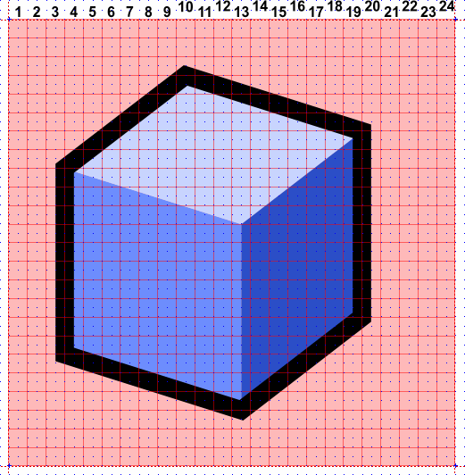
The first order of business when creating new icons, is to find one which reasonably resembles our goal. It is of course possible that no existing icon looks anything like what you're after, but those cases are rare. Let's assume we once more need the Box icon:
 |
The vector source images have been layered to lubricate the alignment and export tasks. In XaraX, layers can reside either in the background or the foreground. Layers in the background (Guides and Background) will not be included when Xara converts the vector drawing to a pixel image. The only object in the Background layer is the green square behind the icon. This square is used to preserve the alignment and positioning of the foreground objects with respect to the pixel-grid. It is of no importance yet.
The Guides layer contains a set of infinite lines that mark the boundaries of all icon areas (the red, dotted lines). It, too, can be ignored at this time.
The Obj_Base layer contains all the objects that make up our icon. The blue faces and the black outline in this particular case.
The Pixelgrid layer contains a red grid which corresponds with the pixels of a 24×24 icon. You can use this grid to align your objects. Additionally, the Xara file has a predefined grid (just like Rhino) which has been preset at half-pixel intervals, this means you can easily snap to pixel-centers and pixel-borders. Using Xara's illustration tools, you can quickly adjust the vector objects to make new icons:
 |
| I dragged a few control points around to new grid locations, made two copies and changed a few colours. Adjusting the icon did not take longer than one minute. |
Once you are happy with the new image, you have to create an icon file that Rhino understands. Depending on which application you are using, you can use one of the following methods:
- Save the icon directly
- Create a base image
Save the icon directly
If your vector illustration program delivers good anti-aliasing on small scales, you can simply save the vector objects directly to a 24×24 *.png file:
 |
| In Xara, this method works very well, especially with properly aligned vectors. Xara's internal renderer automagically snaps certain objects to the pixelgrid, so crispness is easy to attain. The leftmost pane shows the image as it will be saved, the icon itself is only 17 pixels wide and 22 pixels high, but it needs to be positioned in the center of the square icon area, hence the need for a background rectangle. |
Creating a base image
If saving images at small sizes does not give you satisfactory results, you can take the long way round and create a base image. You'll have to downsample it separately in a pixel-editor as discussed in the previous paragraph . This image should be large enough to fit a whole number of times around the icon. I recommend using nice round (from a computers point of view) numbers such as 16, 24 or 32. Starting from an icon size of 24, a few multiplication factors with resultant base dimensions and downsampling factors (the number of base pixels that will go into creating a single icon pixel) are:
| Factor | Dimensions | Downsampling |
| 8× | 192×192 | 64 |
| 16× | 384×384 | 256 |
| 24× | 576×576 | 576 |
| 32× | 768×768 | 1024 |
 |
| Always remember to include the alpha channel in the exported png file. |
I also recommend turning off anti-aliasing when creating base images. It serves no purpose and only gets in the way of post-processing operations.
Geometry rules
When creating your own icons, you should adhere to the Rhino native style. There is no tight set of rules for icons, but a few general pointers do exist:
- All lines in icons should be a whole number of pixels thick (the default set only contains 1 and 2 pixel lines)
- White (or other bright) lines should be at least 2 pixels thick
- Try not to use the pixels along the edges of the icon (this leaves an active icon size of 22×22 pixels)
- Try to use the same view projection as the Box image
- Avoid near-vertical and near-horizontal lines
- Try to avoid using texts in icons (this clashes with localization)
- Use outlines for areas which are adjacent to the transparant background.
- Use the colours in the default palette
Standard palette
| Colour definition (R,G,B) | Usage | |
 | 255,255,255 | Brightest areas of regular objects |
 | 242,242,242 | Normal areas of regular objects |
 | 197,197,197 | Dark areas of regular objects |
 | 83,83,83 | Extra dark areas of regular objects |
 | 200,212,255 | Brightest areas of emphasized objects |
 | 110,142,255 | Normal areas of emphasized objects |
 | 45,80,200 | Dark areas of emphasized objects |
 | 0,32,136 | Extra dark areas of emphasized objects |
 | 255,235,116 | Brightest areas of selected objects |
 | 255,218,0 | Normal areas of selected objects |
 | 175,90,0 | Dark areas of selected objects |
 | 118,60,0 | Extra dark areas of selected objects |
 | 225,0,0 | X-axis |
 | 33,178,0 | Y-axis |
Footnotes
^1^ Applications who render anti-aliased geometry onto the screen use a method similar to this, but downsizing a pixel image (downsampling) has the same effect.
^2^ Note that if you have access to a good pixel-editor you could technically use a whole range of tools and filters (blurring, hue changes, contrast adjustments to name but a few) on the small icon images. You'll have to extract the icon from the button onto the hard-drive and edit it separately though. Rhino only provides the most basic drawing tools.
^3^ Many high-end pixel editors provide more ways than one to deal with transparant pixels. The most common modes are Alpha-channels and Mask-layers. The difference between the two, is that alpha-channels contain the transparancy information in the colour of the pixels itself, while mask layers simply use a separate grey-scale image to control the transparancy. If you're having problems saving *.png files with proper transparancy information, try switching between these modes.
Downloads
| Download all Base images (768×768 pixels) for the 24×24 icons: | NOT YET AVAILABLE (0 kb) |
| Download all Base images (768×768 pixels) for the 32×32 icons: | NOT YET AVAILABLE (0 kb) |
| Download all vector images (*.xar format) for the 24×24 icons: | NOT YET AVAILABLE (0 kb) |
| Download all vector images (*.xar format) for the 32×32 icons: | NOT YET AVAILABLE (0 kb) |
| Download all vector images (*.ai format) for the 24×24 icons: | NOT YET AVAILABLE (0 kb) |
| Download all vector images (*.ai format) for the 32×32 icons: | NOT YET AVAILABLE (0 kb) |
{@


![]()
![]()

![]()
![]()
![]()
![]()
![]()
![]()

}@
]
it/rhino/iconerhino.txt · Last modified: 2020/08/14 (external edit)