Sidebar
Grasshopper Interface Explained
The main dialog
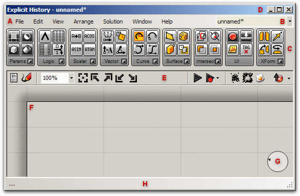
Once you have loaded the plug-in, the _Grasshopper command will display the main Grasshopper window:
This interface contains many different elements, most of which will be familiar to Rhino users:
D: The window title bar
The Editor window title bar behaves different from most other dialogs in Microsoft Windows. If the window is not minimized or maximized, double-clicking the title bar will fold or unfold the dialog. This is a great way to switch between the plug-in and Rhino because it minimizes the Editor without moving it to the bottom of the screen or behind other windows.
Note: If you close the Editor, the Explicit History geometry previews in the viewports will disappear, but the files won't actually close. The next time you run the _ExpHisEditor command, the window will come back in the same state with the same files loaded.
A: The main menu bar
The menu is similar to typical Windows menus, except for the file-browser control on the right B. You can quickly switch between different loaded files by selecting them through this drop-down box. Be careful when using shortcuts since they are handled by the active window. This could either be Rhino, the Explicit History plug-in or any other window inside Rhino. Since there is no undo available yet you should be cautious with the Ctrl-X, Ctrl-S and Del shortcuts.
C: Component panels
This area exposes all component categories. All components belong to a certain category (such as Params for all primitive data types or Curves for all curve related tools) and all categories are available as unique toolbar panels. You can adjust the height and width of the toolbars, allowing more or fewer on-screen buttons per category.
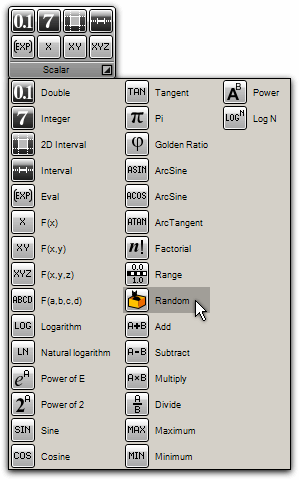
The toolbar panels themselves contain all the components that belong to that category. Since there is a potentially large number of these, it only shows the most recently used items. To see the entire collection, you have to click on the extremely difficult-to-hit bar at the bottom of the panel:
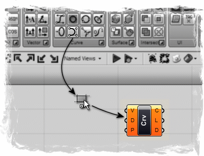
This will pop up the category panel which provides access to all objects. You can either click on the objects in the popup list, or you can drag directly from the list onto the canvas. Clicking on items in the category panel will place them on the toolbar for easy future reference. Clicking on buttons will not add them to the canvas!. You must drag them onto the canvas to add them:
E: The canvas toolbar
The canvas toolbar provides quick access to several oft-used features. All the tools are available through the menu as well, and you can hide the toolbar if you like. (It can be re-enabled from the View menu).
The canvas toolbar exposes the following tools (from left to right):
- Definition properties editor. This part of the plug-in isn't finished yet.
- Sketch tool.
- Zoom defaults.
- Zoom Extents. Will adjust the zoom-factor if the definition is too large to fit on the screen.
- Focus corners. These four buttons will focus on the four corners of the definition.
- Named views. Exposes a menu to store and recall named views.
- Rebuild solution. Forces a complete rebuild of the history definition.
- Rebuild events. By default Explicit History responds to changes in Rhino and on the canvas. You can disable these responses though this menu.
- Cluster compactor. Turn all selected objects into a Cluster object. Cluster objects are not finished yet.
- Cluster exploder. Turn all selected clusters into loose objects. Cluster objects are not finished yet.
- Bake tool. Turns all selected Explicit History geometry into actual Rhino objects.
- Preview settings. Explicit History geometry is previewed by default. You can disable the preview on a per object basis, but you can also override the preview for all objects. Switching off Shaded preview will vastly speed up some scenes that have curved or trimmed surfaces.
- Hide button. This button hides the canvas toolbar. You can switch it back on through the View menu.
F: The canvas
This is the actual editor where you define and edit the history network. The canvas hosts both the objects that make up the definition and some UI widgets G.
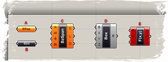
Objects on the canvas are usually color coded to provide feedback about their state:
A: Parameter. A parameter which contains warnings displays as an orange box. Most parameters are orange when you drop them onto the canvas since the lack of data is considered to be a warning.
B: Parameter. A parameter which contains neither warnings nor errors.
C: Component. A component is always a more involved object, since it contains input and output parameters. This particular component has at least one warning associated with it. You can find the warning and errors through the context menu of objects.
D: Component. A component which contains neither warnings nor errors.
E: Component. A component which contains at least one error. The error can come either from the component itself or from one of its input/output parameters.
All selected objects are drawn with a green overlay (not shown).
H: The status bar
The status bar provides feedback on the selection set (not yet implemented) and the major events that have occured in the plug-in. You can see a list of all recent events by clicking on the rightmost field in the status bar.
The remote control panel
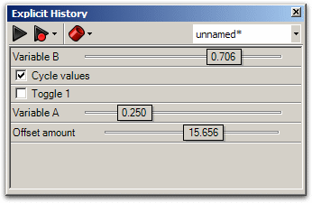
Since the Explicit History window is quite large, you may not want it on the screen all the time. Of course you can minimize or collapse it, but then you can't tweak the the values anymore. If you want a minimal interface to the values inside the currently active definition, you can enable the remote panel. This is a docking dialog that keeps track of all sliders and boolean switches (and possibly other values as well in future releases):
The remote panel also provides basic preview, event, and file-switching controls. You can enable the panel through the View menu of the Main window, or through the _ExpHisPanel command.
Viewport preview feedback
Since the Explicit History window is quite large, you may not want it on the screen all the time. Of course you can minimize or collapse it, but then you can't tweak the values anymore. If you want a minimal interface to the values inside the currently active definition, you can enable the remote panel. This is a docking dialog that keeps track of all sliders and boolean switches (and possibly other values as well in future releases):
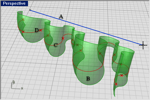
A: Blue feedback geometry means you are currently picking it with the mouse.
B: Green geometry in the viewport belongs to a component which is currently selected.
C: Red geometry in the viewport belongs to a component which is currently unselected.
D: Point geometry is drawn as a cross rather than a rectangle to distinguish it from Rhino point objects.

